Two years ago you checked 40 tabs to understand what happened in the market. Price charts, earnings calendars, sector ETFs, Reddit threads, Twitter feeds. By the time you pieced it together, the move was over. The AI Financial Assistant changed that. Now the whole story sits on one screen — every stock, every sector, every rotation, color-coded by who's winning and who's bleeding.
March 2026. Tech rallies while energy dumps. Financials hang flat. You see it in 3 seconds on a heatmap, not after scrolling through 500 tickers. That's the shift. AI didn't just speed up analysis. It replaced the entire workflow.
Best AI Financial Assistant Tools for Pattern Recognition
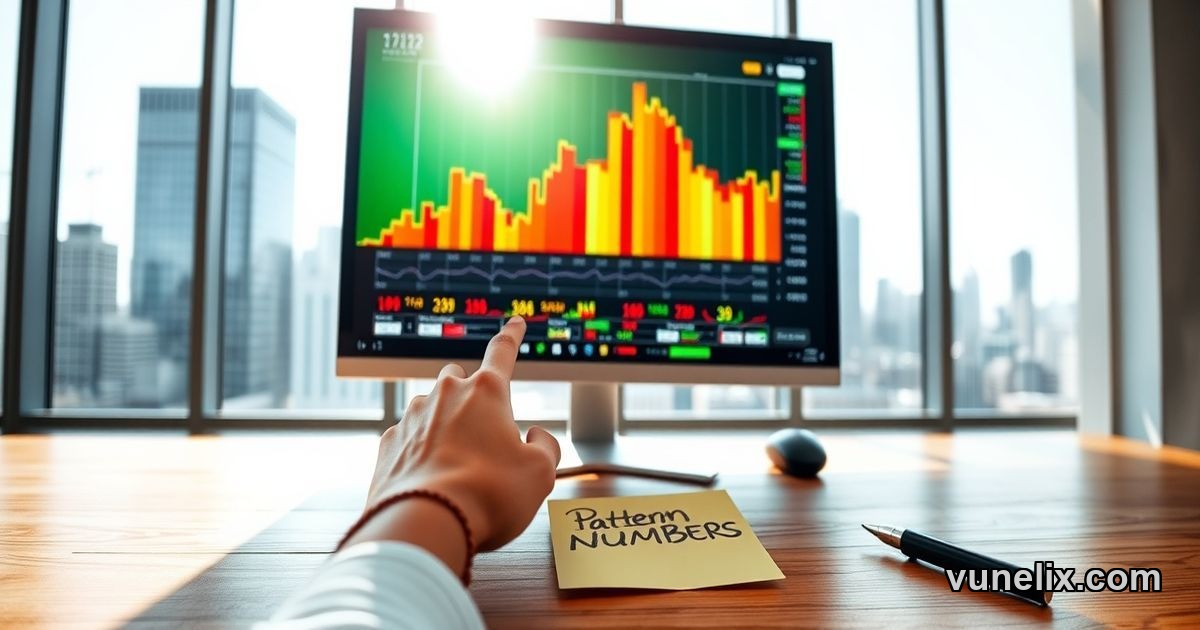
Humans suck at processing visual data fast. We're good at patterns, terrible at reading columns of numbers. The AI Financial Assistant review from institutional traders says the same thing — heatmaps beat spreadsheets because your brain processes color and size instantly. When the entire Technology sector glows green while Financials turn red, you don't need to check individual stocks. The narrative is obvious.
Treemap visualization does something simple but powerful. Block size shows market cap. Apple, Microsoft, NVIDIA take the biggest space because they're trillion-dollar companies. Color shows daily change — green up, red down. That's it. But it reveals what matters: is the S&P 500 rally real or just 5 mega-caps doing heavy lifting while everything else tanks?
S&P 500, Nasdaq 100, Dow Jones 30, All US Stocks. You switch between views in one click. Pre-market, you scan to see overnight gaps. Intraday, you watch sector rotation live. End of day, you review which industries led or lagged. Same tool, different use case, zero friction.
How to Use AI Financial Assistant for Sector Rotation
Sector rotation drives bull markets. Money flows out of defensive plays into cyclicals. Out of value into growth. Out of energy into tech. But spotting rotation early means tracking 11 GICS sectors across hundreds of stocks. Nobody does that manually anymore.
FCSAPI powers the data feeds behind tools like this — real-time pricing, market cap, volume, all updated during trading hours. The AI for stock market analysis layer sits on top, organizing everything visually. You don't read data. You see it. Healthcare fading? Small red blocks cluster together. Energy surging? Big green blocks dominate that corner. Instant read.
Click any stock block and you get the drill-down: current price, day change, market cap, P/E ratio, 52-week range, dividend yield, volume. Full stock page access from the heatmap. You go from macro view to micro detail without opening new tabs or switching platforms.
Daily vs Weekly vs Monthly Performance Views
Short-term traders care about intraday moves. Swing traders want weekly performance. Position traders track monthly and YTD trends. Same heatmap handles all timeframes. Switch between daily, weekly, monthly, year-to-date, yearly. The color coding adjusts. Patterns emerge. A stock green on the day but red on the month tells you something different than green across all periods.
AI Financial Assistant Guide: Why Crypto Needs This Too
Crypto moves faster than stocks. Bitcoin pumps, alts follow or they don't. DeFi rallies while meme coins dump. Layer-1s outperform or get crushed by Layer-2s. You need the same visual clarity — market cap, daily change, sector breakdown. Just coins instead of companies.
The AI Financial Assistant 2026 approach works because it's asset-agnostic. Stocks, crypto, forex — anything with price and volume fits the model. Traders who used equity heatmaps for years switched to crypto heatmaps in 2024-2025 when altcoin volatility spiked. Same pattern recognition skill, different asset class.
But crypto has 20,000 tokens. Stocks have 3,800 on Nasdaq. Scale matters. Heatmaps filter noise. You see Bitcoin, Ethereum, the top 100 by market cap. Everything else is too small to move the market. Focus follows the money. That's the point.
Market Breadth and Mega-Cap Influence
The S&P 500 was up 1.2% last Tuesday. Sounds healthy. But Apple, Microsoft, NVIDIA, Amazon — the four trillion-dollar stocks — rallied 2.5% while the median stock in the index was flat. That's not a broad rally. That's four companies doing all the work. Heatmaps show this instantly. Four massive green blocks. Everything else mixed or red.
Market breadth tells you if the move is sustainable. Narrow rallies led by mega-caps tend to reverse. Broad rallies with small caps confirming — those run longer. You can't see breadth in a price chart. You see it in a heatmap where 500 blocks give you the full picture in one glance.
Small Caps and Index Rebalancing
When Russell 2000 outperforms S&P 500, risk appetite is high. Investors move down the market cap ladder into smaller, riskier names. When small caps lag, money flows back to safety — mega-cap tech, healthcare, staples. This rotation shows up as size and color shifts across the heatmap.
Index rebalancing also matters. When a stock gets added to the S&P 500, passive fund inflows push the price higher. When it gets dropped, outflows hit. Heatmaps don't predict this, but they show the price action when it happens. You see the block suddenly grow or shrink as volume spikes.
Live Monitoring vs End-of-Day Analysis
Professional traders keep a heatmap open all day. Not to stare at it — to check when something feels off. The whole screen shifts from green to red in 20 minutes? That's not normal. You investigate. A single sector flips while everything else holds? Sector-specific news just dropped.
Retail traders use it differently. Morning scan before the open. Quick check at lunch. Review after close. Three snapshots a day. That's enough to stay informed without getting sucked into noise. You're not day trading every wiggle. You're tracking the bigger picture — trend, rotation, leadership.
Both approaches work. The tool adapts to your style. That's why AI for stock market analysis isn't about replacing humans. It's about giving humans better inputs so they make better decisions faster.
Why This Matters More in Volatile Markets
Bull markets are easy. Everything goes up. You don't need a heatmap to see green. But in choppy markets — like Q1 2026 after the January correction — rotation happens daily. Tech up Monday, down Tuesday. Energy rallies Wednesday, gives it back Thursday. Financials flat all week. Tracking this manually is exhausting. Visually, it's obvious.
Volatility clusters. When VIX spikes above 20, sector dispersion widens. Some sectors swing 3% while others barely move. Heatmaps highlight this divergence. You see which pockets of the market are stable, which are chaotic. That guides position sizing, stop placement, risk management.
The worst mistake in volatile markets is assuming correlation. Just because the index is up doesn't mean your stock is up. Just because tech is down doesn't mean all tech is down. Heatmaps kill assumptions. You see the truth, not your bias.
Does your current workflow show you sector rotation in real-time, or are you still checking tickers one by one?
Explore more tools and market data on FCS API.